woensdag 22 april 2015

A "New Making Of "

First of all , my apologies for the lack of updates, but I’m back with yet another “making of post “.  
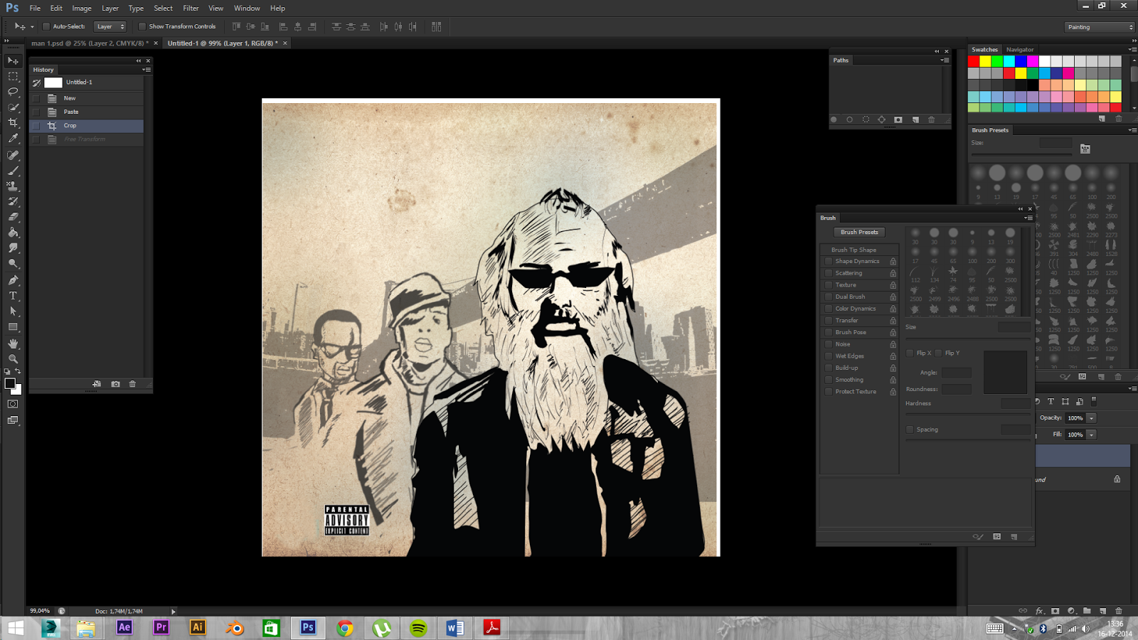
this portrait started  as series of thumbnail sketches. Just to see what kind of poses felt right for the person I was illustrating. At first I wanted to go for a more "Tron" like feeling, but ultimately decided to make him more like Superman, who is in the process of revealing his outfit /transforming.

After I got my pose I needed to  finetune some details, like face and background.

 The inking part was done oldschool with some fineliners and pens. After that I’ve scanned it into Illustrator, finetuned some lines and wen straight into Photoshop for some coloring and SFX . Again I like to combine oldschool drawing with digital work.

The background is actually the logo of his company!


maandag 30 maart 2015

Vinyl Cover

So here's a project I did a few months back. A newly established music company was looking for designers/ illustrators to submit their designs/ illustrations for the  LP -packages they were going to send to their subscribers. This packages would contain a vinyl disk with the music chosen by a curator ( someone famous from the music industry) and a letter with some insight into his choices. Unfortunately my idea did not make the cut, but I can post it here for you all to see

First of all I wanted to make sure that the cover of the package was personalized to the curator, with an illustration/ portrait which tells a little bit of his background. In this case I've chosen Rick Ruben ( Def Jam Records, who produced albums for Jay-Z, Kayne West and  Slipknot) as an example.  I didn't wanted to use colors but let the texture of the package fill in my inks as it were.

 The curator (Rick Ruben) would get more refined look, while everything behind him, would get softer (just to suggest some depth). I drew him first on paper, inked thee portrait then scanned it into illustrator. I also added some whites but removed them during the process Turned my lines into vectors. I placed Jay-Z & Kayne West more in the background with  gray colors. As a final touch I added New York city in the background. You'll find some screens below:


maandag 9 maart 2015

Tattoo

Well hello there! It's been a while since I've posted another blog. But do not worry! Here's another "making of"of a concept/sketch  for a tattoo that I've designed for someone. Mind you, it's not the final and this design will be altered by another artist. And yes, those are butterflies and no I don't feel any less manly! It started with some simple thumbnails sketches, which I then scanned into Illustrator. As you can see I was looking at some references on Pinterest, just to see how it would fit on the body. After digital inking  it went straight to coloring. At first I wanted to make it a more surreal/ Giger -inspired but ultimately the client wanted them to be more colorful, no vines and a little spread out. I also wanted t crate some sense of depth. So here you have it my first concept tattoo design:


maandag 26 januari 2015

Illustrating A Cover


Another day, another  "the Making of Post":

So a colleague of mine asked me to illustrate the cover for her internship report. Because I only had two days, it would be very simpel, but effective and also black & white.  I wanted to give her a more calm expression and this time no masks. It started with a few thumbnails sketches. After that, it was choosing one an then sketching it big, scanning, and digital inking. Again the challenge was combining my style with hers. Less macho, more tranquility :). So here are some shots.


zondag 18 januari 2015

Zulfugar.nl is finally online! Another Behind the scenes look!


First of all my new portfolio website is finally online at: www.zulfugar.nl! ( if you're viewing this from my blogger) If you're viewing this from website then welcome to my official portfolio! I promise I'll tryn to blog more regularly! It was kind of hectic time for me. It was a long time coming but it;s finally here! And I'm glad! A very big thank you for "Atelier Mintis"( www.mintis.nl) for all the hard work! But I'm back with more updates and another behind the scenes look.

So this portrait was all about the Film Noir feel. The lady wanted a Sin City feel to this piece. A lot of inspiration came form Eva Green's character Ava Lord from Sin City 2. Also it was a challenge to combine my style with that from Frank Miller's Sin City graphic novel. As always it started with a few thumbnails in my skethbook. Just to get the composition and the references right. This time I did not make a big sketch on paper but went into photoshop directly. After that it was inking with vectors then back into Photoshop for some coloring. This time I didn't have to color the whole portrait,
but only her eyes and her lips ( Just like Eva Green's from the movie) Here are some progress shots. The whole portrait will be up on my website this week.